Category Archives: numbers

More Forest Numbers and Tree-Planting Drones

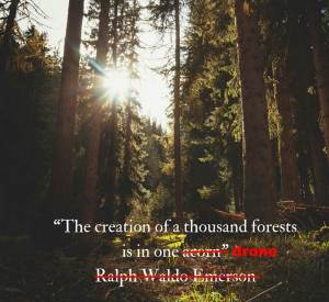
Here’s a new idea under the sun… tree-planting drones.

Drone

Take a minute and think about all of the forest products you use in a day. I’m sitting on one right now as is my laptop. Anyone who’s bought school supplies in the last weeks has also consumed a fair amount. As an avid list-maker, I use my fair share of small pieces of paper for reminders and tasks to be done. Of course, let’s not forget the oxygen. The U.S. Forest Service estimates that forest products account for 4.5% of the total U.S. manufacturing gross domestic product at $190 billion in products annually and employing >900,000 people. There’s little room for doubt, forests are valuable both as they stand and as they fall.

I’ve mentioned before that numbers are important. In this context, numbers about forests can be extremely valuable. New research in Nature this week gives a new estimate of our global tree density. The good news… The earth has nearly an order of magnitude more trees than previously estimated by satellite imagery. The research team puts the total number of trees on the planet at 3.04 trillion. That’s more than 400 trees per person. To you, these numbers are likely just interesting statistics to impress your friends, but to scientists, conservationists and the forestry industry the new estimates of tree density are important for guiding management policies.

The new estimate is based on more than 400,000 ‘ground-sourced measurements of tree density from every continent except Antarctica.’ Translation: A lot of man-hours were spent by humans in a forest collecting tree density data. Of course, the team wasn’t able to count each and every tree, but this is more accurate data than estimating tree numbers from space. Check out the video below for a great data visualization of the world’s forests based on this new research.

If you were paying attention, forest numbers are not static. For various reasons around the globe forests are declining. Current estimates give a net loss of 10 billion trees a year. Some of this loss is due to forest fires, but for decades the forestry industry has become increasingly mechanized to efficiently harvest trees for all of those useful forest products. On the other side of the equation, replanting new trees has not experienced the same industrialization and relies heavily on meticulous man hours and dirty hands. The company BioCarbon Engineering seeks to change this and offers a new scalable model for planting trees using drones. Yes, drones for a noble purpose. The drones are engineered to shoot bullets wrapped in a biodegradable casing and containing soil with pre-germinated seeds into the ground. This could be used for replanting after forest fires or in other areas where forests need help with recovery.

From BioCarbon Engineering

From BioCarbon Engineering

They estimate that they can scale up to 1 billion trees per year. It greatly decreases the amount of human hours involved compared to hand-planting. It’s also more efficient relative to mass seeding because the seeds are pre-germinated, which will eliminate the loss due to bad seeds. The numbers are still not yet in the trees’ favor, but closing the gap with deforestation is a step in the right direction and the Lorax would be proud.

Johnna

*Of course, BioCarbon Engineering could always enter into a relationship with that BIOS Urn company that uses your cremated ashes as the germination medium for tree seeds. Then you and your loved ones could have your ashes with tree seedlings shot almost anywhere to make a stand of trees somewhere in the wilderness rather than just one tree at a time with a single urn. But as I’ve mentioned before, that’s not exactly how photosynthesis and the carbon cycle works.

//The blog has been dark for a record length of time. Only for lack of time and not material. Regularly scheduled posts coming soon.

References and Links:

http://www.nature.com/nature/journal/vaop/ncurrent/full/nature14967.html

http://www.nature.com/news/global-count-reaches-3-trillion-trees-1.18287

For more on the tree-counting research, check out this post over at The Quiet Branches blog.

http://www.biocarbonengineering.com/

http://www.biocarbonengineering.com/blog/deforestation

http://www.biocarbonengineering.com/blog/deforestation-data

http://www.biocarbonengineering.com/blog/what-is-the-social-value-of-a-tree

http://www.msnbc.com/greenhouse/watch/using-drones-to-improve-reforestation-445645891970
http://www.fao.org/docrep/014/am859e/am859e08.pdf

http://www.fs.fed.us/

Dangerous Photosynthesizers

Because photosynthetic organisms are the energetic foundation of our biosphere, we always tend to think of them as allies, organisms with a positive connotation. Their trademark color green is universally linked with goodness, growth, and life. However, there are some bad apples in the bunch that just seem to have it out for us heterotrophs. Well, maybe not apples (though I’m sure there are some poisonous apples out there somewhere*), but nature is filled with examples of poisonous plants. Many toxins and pharmaceuticals have botanical origins.

The focus of today’s blog post sinks even lower- algae, pond scum, cyanobacteria. Most of these aquatic photosynthesizers quietly convert sunlight to biochemical energy without any ill effects to anyone. I’ve written previously, that under the right conditions (warm and nutrient-rich waters) these otherwise inconspicuous organisms bloom in great numbers and overwhelm their environments. Like all life on earth, algae are programmed to capitalize on favorable conditions for reproduction. The ultimate crashes of these blooms can result in aquatic dead zones, areas with dissolved oxygen levels too low to support life.**

Algal bloom in Lake Erie 2011 from the NASA Earth Observatory Credit: Jesse Allen and Robert Simmon via Wikimedia

However, in some cases, the effects of these algal ‘blooms’ go beyond sheer numbers. Some algae produce toxins which cause serious health problems for those of us heterotrophs sharing their environment. The individual constituents of these ‘harmful algal blooms’ (HABs) measure in at ~1-2 µm, but they can wreak all kinds of havoc on the scale of large cities. HABs can stop your summer fun by forcing beaches to close or eliminating certain shellfish from your diet, but this summer the problems went beyond recreation to something much more fundamental- potable water.

Clean, safe drinking water is a fundamental service of human civilization. In our modern society, just turn on the tap, cook, clean, bathe, drink. It has been such a staple of American cities that it is taken for granted. That is, until it’s no longer available. That was the exact situation in Toledo earlier this month. A large American city, in the year 2014, was without safe drinking water for a whole weekend. Approximately, 500,000 citizens were affected. All because of toxic algae.

Microcystin-LR chemical structure Credit: cacycle via Wikimedia

In this case, the culprit was a bloom of cyanobacteria which produce the toxin microcystin. This molecule is harmful to the health of humans, pets and wildlife by acting as a liver toxin. It also has neurotoxic effects. The toxicity of microcystins has been extensively characterized and long-known to be associated with certain cyanobacterial species. Because of the potential adverse effects of microcystin-producing cyanobacteria on modern water supplies, treatment facilities routinely check the levels of this toxin. Only one part per billion of this molecule is considered acceptable. When a microcystin-producing algal bloom occurs near the intake of a municipal water supply (as it did for Toledo this month) the facilities can quickly be overwhelmed causing the water supply to exceed acceptable microcystin levels. The situation is compounded by the fact that microcystins are resistant to boiling. While boiling water may destroy other toxins or contaminating bacteria, it only concentrates microcystins. In order to bring the toxin levels down, the problem must be addressed at the water treatment facility (using methods like activated carbon, ozone treatment and membrane filtration). By adjusting the normal procedures to account for increased microcystins, the water supply can be treated to once again safe levels. All of this is accompanied by exhaustive analysis of microcystin levels and vigilant monitoring after the incident.

Scientists and government agencies are always working to monitor our water systems for HABs. Check out some of the links below for descriptions of continuous efforts to monitor our environment for HABs. How do we get to the point of 500,000 people without water for a weekend with everyone watching out for it? I mean, we’re watching it from space! Even with all of these sophisticated tools and models, nature can be surprisingly swift. Check out these images and reports from the NOAA Great Lakes Environmental Research Lab on Aug 1, 2014 and Aug 4, 2014 showing false-colored images tracking the algal growth.

Simultaneously in the news cycle with the Toledo water crisis, two Ebola patients were being treated in premier isolation facilities on American soil. The nation’s attention was rapt with the details of their treatment and speculation was rampant as to the possibility of an outbreak in America (an infinitesimally small probability not worth talking seriously about among scientists and epidemiological experts, but a great ratings-driver). Worldwide, the Ebola death-toll numbers in the thousands, not just from this year, but ever. Based on pure body count, there are many deadlier infectious diseases, which we as the public dismiss more easily. Beyond those numbers, the lack of clean water for drinking, food preparation and sanitation results in the deaths of ~3 million people every year across the globe. A safe and reliable water supply, as a basic right, continues to elude human civilization.

Water, water everywhere, but not a drop to drink… Credit: de:Benutzer:Alex Anlicker

HABs are only a part of the world’s water problem. However, the disruption of Toledo’s water supply should have been an event that caught our attention and held it for a while longer. It may be easy to turn on the tap, but getting the clean water to that point takes a significant amount of effort with infrastructure maintenance, monitoring and treatment. All of these things are largely invisible to us in modern society. Unfortunately, all of these things are affected by other societal choices like economics, aesthetics, environmental regulations, and the practices of our agricultural systems and other industries. As a society, we should start having the longer, difficult conversations necessary to attack this complicated problem rather than the transient chats that occur when we are in crisis mode. Find out about your community’s water situation and the issues related to your supply. Talk to your community leaders today to ensure that safe water is part of your future.


Johnna

*Hey, it’s hard to transition away from the summer’s Disney theme completely in a single post. However, I’m not just talking about the evil queen’s poisoned apple from the fairy tale. Apples have a huge amount of genetic diversity and I’m sure there are some varieties out there that are poisonous or so foul-tasting that you would think they are. After all, apples concentrate toxic substances in their seeds.

http://www.thepoisongarden.co.uk/atoz/malus_john_downie.htm

**In case you’re wondering, this year’s Gulf of Mexico hypoxic zone measured ~5500 square miles. That’s not breaking any records for size, but still about as large as the state of Connecticut. Read more about it here.


References and Links:

http://oceanservice.noaa.gov/hazards/hab/

http://www.cop.noaa.gov/stressors/extremeevents/hab/current/noaaHab.aspx

http://www.cop.noaa.gov/stressors/extremeevents/hab/current/HAB_Econ.aspx

http://www.cdc.gov/nceh/hsb/hab/default.htm

http://www.whoi.edu/redtide/page.do?pid=14898

http://www2.epa.gov/nutrientpollution/harmful-algal-blooms

http://www2.epa.gov/nutrientpollution/effects-human-health

http://www.dispatch.com/content/stories/local/2014/08/04/this-bloom-is-in-bad-location.html

http://www.lakeeriewaterkeeper.org/

http://www.gulfhypoxia.net/news/default.asp?XMLFilename=201408111452.xml

http://en.wikipedia.org/wiki/Microcystin

http://iaspub.epa.gov/tdb/pages/contaminant/contaminantOverview.do?contaminantId=-1336577584

http://www.weather.com/health/what-you-need-know-about-microcystin-toledos-water-toxin-20140804

http://water.org/water-crisis/water-facts/water/

http://water.org/water-crisis/one-billion-affected/

http://www.cdc.gov/healthywater/global/wash_statistics.html

What’s not new under the sun? This blog!

Today marks the 1 year anniversary of this blog. That’s right, it has been one year today since I clicked the publish button on my first post (UNLESS: What is your truffela seed?). It’s hard to remember how much anxiety I had over releasing my writing onto the internet to an audience of maybe three people. What a difference a year makes! Thanks to all of the stats that WordPress collects, here’s the year-in-review rundown with links to what you may have missed*…

The blog has 668 followers, which I find pretty amazing for a photosynthesis and plant science blog. This means that 668 people took the time to click the follow button or submitted their e-mail address to automatically receive my posts. This doesn’t really even count my lazy friends and family on Facebook or Twitter followers that catch my links via shameless self-promotion on social media.

Altogether, the blog has had 18,605 views with almost 1.5 page views per visitor. I’d like to think that means that most people that have stumbled upon a post have dared to click another. My all-time best for a single day’s worth of page views was Postdoc Appreciation at 275 views, but I can’t take too much credit because it is mostly just a collection of highly entertaining PhD Comics. However, the all-time most-viewed posts over the last year were somewhat surprising to me:

  1. Photosynthetic Light/Dark Reactions
  2. The Home Page
  3. Photosynthesis: Not Just for Plants

Well, not that surprising considering that most of the search terms that landed visitors to my site included terms like “photosynthesis light and dark reactions or photosynthesis not plants.” I hope that the visitors using these search terms were students seeking clarification or a different presentation of something they saw in one of their classes or life-long learners trying to refresh their memories of a fundamental metabolic process. I hope they found what they were looking for, but they sure didn’t feel strongly enough one way or the other to comment positively or negatively below the posts/pages they found. Though not common, the winners for my favorite search terms leading to blog post clicks were “can pandas do kung fu” and “photosynthesis is crazy.” If you’re new to the blog today, that should really give you a feel for my range as a science blogger.

Beyond these basics, size matters when it comes to blog post popularity. The next most popular post after photosynthesis basics and whatever happens to be on my home page- Super Photosynthesizer Hyperion (The World’s Tallest Tree).

Some posts that were among the least popular but definitely deserve a click: SLIPS, Cyanobacteria shed, Mass out of thin air and Adamantium (for plants!). Not to mention this holiday favorite: The Scientific Night Before Christmas. Don’t miss them again this time around. Some other of my personal favorites that I thought would be more popular: Why bother being a scientist?, Science, Pandas and Kung Fu, The Rules of Biochemistry and Behind the Music: Plants. Click and read, remember I will know if you don’t.

In addition to writing for this blog, I’ve also written posts elsewhere. Check out this piece from the ASM Blog Small Things Considered on a mysterious microbial marriage that borders on scandalous. I’ve written a personal postdoc perspective for The Postdoc Way. I’ve also written posts for and hosted the plant science blog carnival Berry Go Round.

All of this writing has amounted to 168 posts or about one every other day. I’ve started a few blog post series: Holiday Plants, Superhero PhD, A new social contract between science and society, GMO Food, Journal Club. Writing this year-in-review has made me painfully aware of how much I’ve let some of these lapse. Sorry! I will continue them eventually (or your money back).

Even though this domain name isn’t shiny and new anymore, the sun isn’t setting on this blog. It will continue to be your source of new science related to plants and photosynthesis. So, check out the links for what you may have missed this past year and make sure to give the blog a follow so you don’t miss another post.


Johnna

*I tried to warn you that I knew what you were clicking, but you just don’t listen.

GMO Numbers

UPDATE: This is part of a series on GMOs. Links for all of the posts for this series are indexed on my highlights page. Check out all of them.

Let’s start with some GMO numbers. For this post, let’s focus on how much GMOs are contributing to global agriculture. This is not shrouded in mystery; several organizations are very meticulously recording agricultural statistics. 170 million hectares of world crop acreage are planted with GMOs. Check out this infographic from ISAAA about GMOs worldwide.

The major crop plants with GMO varieties include corn, soybeans, cotton, and sugar beets. These crops have been altered to include herbicide resistance, insect resistance or both. How does this breakdown with respect to percent of these major crops planted in the U.S.? As shown below, these GM varieties already have huge market shares in the U.S. agricultural system.

Corn: 90%

Soybeans: 93%

Cotton: 90%

Sugar beets: 95%

Genetic engineering isn’t just limited to these major staple crops. A number of other specialty crops have been altered as well. The major driving force behind these modifications has less to do with herbicides and pesticides, but with disease resistance. Sometimes viral and bacterial plant pathogens wreak havoc on certain species at a rate where breeders and growers just cannot overcome the disease by conventional methods. These diseases take advantage of a monoculture (large field or grove of genetically identical plants) of susceptible plants and usually involve an insect vector to help spread the disease. This means that while farmers and scientists are trying to develop new solutions, the bugs must be more thoroughly controlled, which often takes the form of increasing chemical pesticide applications.  Papayas have been genetically modified to be resistant to Papaya Ringspot Virus (PRSV), a disease that has drastically reduced the papaya industry in Hawaii. While the papaya still hasn’t recovered to its peak harvest from 1984, the transgenic trees are helping with its comeback. The HoneySweet Plum has been engineered to resist the plum pox virus. Tomato, squash, pepper, and potato varieties have also been engineered for viral resistance.

The prevalence of these genetically modified crops may surprise you. While the trends are moving toward planting more GMOs, the 170 million hectares of GMOs are only ~3.5% of the total agricultural land on Earth. What if you were trying to avoid consuming GMO products?* Check out these suggestions. I should note that the majority of GMO crops (corn and soybeans) fuel the animal feed market. So, if you are eating non-organic meat of any kind, then those animals have probably dined on GMO feed.

Stay tuned for more information on how GMOs are currently created, tested and put into production. Hopefully this will start a discussion on how you think these things should be done. After that, I will cover issues related to business and societal ethics of GMOs.

Johnna

*For the record, the overwhelming majority of studies suggest that these GM crops are safe for consumption. You may still want to avoid them for other reasons, which we’ll get into later, but these plants have been extensively tested for safety.

For additional numbers and information about GMOs, check out the following websites:

http://www.gmo-compass.org/eng/home/

http://www.biofortified.org/

http://www.isaaa.org/default.asp

References:

http://www.isaaa.org/resources/publications/briefs/44/pptslides/GlobalStatusFlyer2012.pdf

http://www.isaaa.org/resources/publications/briefs/44/infographic/Brief%2044%20-%20Infographics.pdf

http://www.fao.org/docrep/015/i2490e/i2490e04d.pdf

http://www.ers.usda.gov/data-products/adoption-of-genetically-engineered-crops-in-the-us.aspx#.UgHBiW2wXN4

http://www.ers.usda.gov/topics/crops/sugar-sweeteners/background.aspx#.UgP3022wXN4

http://www.gmo-compass.org/eng/grocery_shopping/fruit_vegetables/14.genetically_modified_papayas_virus_resistance.html

http://hawaiitribune-herald.com/sections/news/local-news/papaya-gmo-success-story.html

http://www.gmo-compass.org/eng/database/plants/61.plum.html

5800 square miles

LUMCON’s Gulf of Mexico Shelf Cruise of 2013 was completed last weekend and the final numbers are in for this summer’s hypoxic zone5800 square miles. While smaller than predicted based on earlier measures of nutrient loading and rainfall, this is still a huge area. It’s larger than the average hypoxic zone for the last five years. It’s larger than the state of Connecticut. Check out the figures below from the 2012 and 2013 LUMCON hypoxia press releases. (Remember that the 2012 hypoxia zone was one of the smallest on record due to the severe drought.)

2013 Gulf Hypoxic Zone

2013 Gulf Hypoxic Zone

2012 Gulf Hypoxic Zone

2012 Gulf Hypoxic Zone

The oxygen levels in the dead zone area cannot support aerobic life. Sure, some fish can swim away, but not all aquatic life have the luxury of relocation. For example, some bottom-dwelling fishes and crabs cannot inhabit this area. These species are unsuited for life closer to the surface and consequently must evacuate to other areas of the gulf shelf. This imbalance in biological diversity places a huge stress on the ecosystem in this area- it may not be as simple as ‘everything will come back once the hypoxia dissipates.’ This level of recurrent hypoxia will leave scars on the ecosystem and sustained environmental pressures that some species may not be able to ultimately overcome. Scientists are only beginning to relate the hypoxia zone with effects on the animal species that would otherwise live there. So far there has not been a reported decline in the commercial fishing industry in the Gulf, but such sustained pressures on the ecosystem may eventually trickle up to that level.

Finally, the number 5800 square miles is still greater than twice the Mississippi River/Gulf of Mexico Nutrient Task Force Action Plan Goal of ~2100 square miles. In order to reach this goal, significant decreases in nutrient loading must occur (meaning using less fertilizers and dumping less nitrogenous waste upstream in the watershed). Corn accounts for 40% of all fertilizer use in the US. It requires more nitrogen fertilizer than any other crop, both in per acre usage rate and total consumption. By these numbers, our all-American supercrop contributes significantly to the nutrient runoff fueling the hypoxic zone in the Gulf. The Fertilizer Institute, an advocacy group for the fertilizer industry, has data that shows an 87% increase in corn yield with a -4% fertilizer use spanning the years from 1980 and 2010. In other words, the amount of corn produced per acre has nearly doubled over this time span, while the fertilizer use has decreased. For a variety of reasons, growing corn has, in fact, become more efficient with respect to fertilizer use. However, the total amount of fertilizer used in the US (holding steady around 22 million short tons with some variations due mostly to economic factors) has not seen a significant decrease because of the increase in acres of corn production. According to the USDA, the number of acres of corn planted in 1980 (84 million) to 2013 (97.4 million) has increased by 15%. This has been driven in part by demands from the energy sector (and public policy) to grow corn for ethanol production.

The Nutrient Task Force is working on a number of different fronts to combat the hypoxia problem including developing new strategies for fertilizer efficiency for farmers, reducing industrial pollution, restoring wetland habitats within the watershed, supporting scientific monitoring of the hypoxic zone and increasing public awareness of these interconnected issues. You can read more about it in their report here. Supporting the science to connect these complicated relationships is the lynchpin for the entire project. Once we have a better handle on how different nutrient factors and environmental conditions contribute to hypoxia, the Task Force will be able to form more clearly defined nutrient reduction goals that agriculture and industry can realistically work toward.

Johnna

References:

http://www.gulfhypoxia.net/Research/Shelfwide%20Cruises/2013/

http://www.gulfhypoxia.net/Research/Shelfwide%20Cruises/2013/PressRelease2013.pdf

http://blogs.discovermagazine.com/imageo/2013/07/30/dead-zone-in-gulf-of-mexico-is-size-of-connecticut/#.UfiQ_22wXN5

http://www.tfi.org/statistics/fertilizer-use

http://www.ers.usda.gov/topics/farm-practices-management/chemical-inputs/fertilizer-use-markets.aspx#.UfngdW2wXN4

http://www.nass.usda.gov/Statistics_by_Subject/result.php?08638011-B478-3942-B44F-FA130ADDE283&sector=CROPS&group=FIELD%20CROPS&comm=CORN

http://www.ers.usda.gov/media/117596/err127.pdf

By the numbers: U.S. Old growth forests

English: Redwood trees in Muir Woods National ...

English: Redwood trees in Muir Woods National Monument, just outside San Francisco, California, United States. (Photo credit: Wikipedia)

In case yesterday’s post about Hyperion left you wondering about the greater state of forests in the U.S., I’ve got some numbers for you.

I mentioned in passing that Hyperion was approximately 700 – 800 years old, which is not particularly ancient as far as trees go. The North American continent was a much different place when Hyperion was a sapling. Before European settlement, about 46% of the land that would become the modern United States was forest. By 1907, this number had decreased to 33% and fortunately has remained stable since that time. However, very little (~26%) of those original forests still exist today. Most of this ‘old-growth’ forest resides on public lands in Nation Forests and National Parks. Interestingly, it was estimated that the tract of land on which Hyperion stands came within probably two weeks of being logged before it was annexed into the protection of the parks system.

The economy of forestry and ecological conservation are in a constant policy struggle to balance short-term human needs with longer-term ecosystem-wide needs. Forest products have a value of ~$230 billion dollars annually, but forests also play vital roles as a habitat for many other species and a mechanism for the large scale natural capture of carbon dioxide from the atmosphere. Nevertheless, these related but conflicting interests must compromise to ensure a sustainable existence of forests.

While these facts all seem so logical, there’s something about ancient forests that gives them inherent value worthy of protection. There is an awesomeness there that demands silence. The immense size of the trees and the diversity of life all around make being human seem insignificant, but at the same time a forest affirms your place in the world and restores your spirit. I’m not the only one that thinks so…

“The clearest way into the Universe is through a forest wilderness.” John Muir

“In my deepest troubles, I frequently would wrench myself from the persons around me and retire to some secluded part of our noble forests.” John James Audubon

“It is not so much for its beauty that the forest makes a claim upon men’s hearts, as for that subtle something, that quality of air that emanation from old trees, that so wonderfully changes and renews a weary spirit.” Robert Louis Stevenson

Being in the forest is refreshing, but I, like all of you reading this, sleep at night in a home made of forestry products. So if you also appreciate the latter, value the former.

Johnna

References:

http://www.fia.fs.fed.us/library/briefings-summaries-overviews/docs/ForestFactsMetric.pdf

http://www.globalchange.umich.edu/globalchange2/current/lectures/deforest/deforest.html

http://understory.ran.org/2008/11/11/how-much-old-growth-forest-remains-in-the-us/

https://www.campbellgroup.com/timberland/primer/economy-importance.aspx

http://www.brainyquote.com/quotes/keywords/forests.html

http://www.brainyquote.com/quotes/keywords/trees.html

Extra reading on forest policy: http://ncseonline.org/sites/default/files/BOG.pdf

It’s all about the money: Research Spending

moneyIn yesterday’s post, I encouraged you to be an investor in scientific research. In truth, you already are through your tax dollars. I bet you’d be interested to know how much of your money we are talking about. That is the bottom-line of today’s post.

It may be no surprise to you that the U.S. government does a better job at counting and reporting things like annual corn production in every county and energy consumption from coal than it does how much money it spends. I had a much harder time tracking down current spending and budgetary numbers than I imagined. So if anyone out there accounting for government dollars has additional data or insights, please feel free to comment below. The number I found for U.S. research and development (R&D) spending across all sectors (business, government, other) was ~$400 billion dollars*. For most people, and I assume all of my blog readers, this is an enormous sum of money. But- how does it really add up in the context of all the money we generate and spend?

In the U.S., total R&D spending is just less than 3% of its GDP split among government, industry and other funding sources. Government funding represents just under a third of this number (~0.8 – 0.9% GDP). Business R&D comprises the largest chunk of this total investment with other funding agencies like universities and non-profit organizations having the smallest contribution. The worldwide average of R&D spending is ~2% GDP. Check out this article with very useful graphics comparing global spending on research. If you are interested in more data on European science spending, check out Scienceogram.

researchspendingbreakdown

Clearly, the U.S. is above average when it comes to spending on research. Because it is also the world’s largest national economy with a ~$15.7 trillion GDP in 2012, it also spends the most money in absolute terms as well. (That’s ~$440 billion in spending across all sectors from these figures.) These numbers indicate that the U.S. is the world leader in terms of investment in scientific research. However, now is no time to sit on our laurels. South Korea and Japan are committing larger percentages of their GDPs to R&D, and China’s economy is expanding at a faster pace than that of the U.S. So, the U.S. may have to cede this position in the coming years.

The values for U.S. R&D spending indicate a greater investment and commitment to science by the business sector rather than the government. (Thanks capitalism!) The programs funded by federal money mostly sponsor basic research- fundamentally important things we should know more about, but without a clearly defined application or product. These are projects whose timescale of investment would not survive in a purely capitalistic environment favoring short-term gains. Federal funds also drive research in areas critical to the national interest- food, energy, healthcare, the environment, security. In 2012, that amounted to ~$139 billion dollars.

Do we really need to commit more federal money if we are already spending many billions of dollars each year? Yes. This was the slow and steady increase I mentioned in yesterday’s post. At the very least, we cannot go backward. The President’s budget request for the 2013 fiscal year had only a 0.2% increase in R&D funding. Research funding even across a number of separate divisions (DOE, NIH, NSF, NASA, USDA etc) represents a small portion of the federal budget. The total U.S. budget expenditures in recent years are ~$3.8 trillion dollars. We are only allocating ~3.7% of our total budget for scientific research. With this level of investment, I do not believe as a nation we are investing enough for a comfortable retirement as citizens of earth.

Check out this graphic representation of the U.S. budget for 2010 from PhDcomics.com for some perspective on how science funding ranks in importance when real dollars are on the line or here for another graphic from Scientific American for the 2009 numbers. Surely there are other places within the federal budget than could be streamlined to provide some more room for science given the potential research has to reduce costs in other areas (agriculture, energy, healthcare). Here’s how the budget breaks down for 2011 estimates:

thefederalbudget

What do these budget numbers mean for scientific progress via federally funded research? It means fewer grants are being funded. Federal agencies are reporting funding success rates of ~18 – 20%. (Anecdotal rumors within academia in recent years put these numbers much smaller.) This means only about 1 in 5 submitted proposals will receive funding. With such abysmal success rates for funding, it means ~80% of proposed projects don’t get done. Of course, a percentage of those proposals may have significant flaws, but even accounting for some of those, that’s still a large amount of research left waiting on the lab bench.

While we may be the highest funded system in the world, these numbers are still disturbing. They mean that as a nation we are still only investing a small percentage of ourselves in innovation for the future. It means that our words and our actions are not congruent. It means that we will invest in scientists up to a certain point, but not give them the resources they need to conduct their independent projects. We can do better than this. Before the accountants and economists start coming out of the woodwork to bludgeon my proposal, let’s figure out a way to increase the research funding significantly and steadily in the coming years. Instead of fighting over why we find ourselves in our current state of financial affairs, let’s work toward the future. Even if we were to increase the research spending portion of the budget by 30%, it would still total a very small slice of the federal fiscal pie (less than 5%).**

Johnna

*PPP$ = US dollars at purchasing power parity (PPP$) for the latest year available.

“PPP$ better reflects the real value of investments and allows for more comparability by eliminating differences in price levels among countries. Essentially, this means that a sum of money converted into US dollars at PPP rates will buy the same basket of goods and services in all countries. Source: UNESCO”

**I realize the number representing the 100% for our federal budget is more controversial because of deficits. Every item we increase allocations for now means borrowing money with interest we must pay later. When it comes to science, I still think it’s worth it.

Reference Links

http://www.uis.unesco.org/FactSheets/Documents/sti-rd-investment-en.pdf

http://theconversation.com/infographic-how-much-does-the-world-spend-on-science-14069

http://www.census.gov/compendia/statab/2012/tables/12s0473.pdf

https://www.fas.org/sgp/crs/misc/R42410.pdf

http://www.scientificamerican.com/article.cfm?id=money-for-science

http://www.phdcomics.com/documents/phd041410.pdf

http://www.cbo.gov/sites/default/files/cbofiles/ftpdocs/82xx/doc8221/06-18-research.pdf

http://nexus.od.nih.gov/all/2013/01/02/fy2012-by-the-numbers-success-rates-applications-investigators-and-awards/

http://www.nsf.gov/about/budget/fy2013/pdf/04_fy2013.pdf

2050

2050

Let’s talk about the number 2050 – the year. What do you think life will be like on earth in the year 2050? Maybe most of you respond with optimism about advances in healthcare and electronics that make our lives easier. Maybe scientists finally figured out a way to make those hover cars and jet packs available in everyday life. Maybe you think we will all be subject to the machines at that point. Maybe there will be a zombie apocalypse.

For scientists, we have a different view, but not necessarily any less scary than some of the examples mentioned above. Why worry about 2050? In 2050, the world’s population is projected to reach 9 billion people. This projected milestone has scientists from many fields anxious due to the interrelated consequences that number means for agricultural production, energy demand, climate change and human health. Below are the numbers we’ve been crunching.

Current global agriculture production provides about 2700 calories per person per day. This is more than enough to meet the nutritional needs of everyone on earth. If only it were that simple. Despite this caloric surplus, more than 850 million people (15% of the world’s population) are undernourished. Another 2 billion people have adverse effects from micronutrient deficiencies. A myriad of factors contribute to this problem, but agricultural production is not one of them. However, a strategy of agricultural overproduction is necessary to mitigate the effects of subsequent inefficiencies within the global food system. In the context of 2050, this means that our system has to improve at all levels to accommodate 2 billion more people while providing better overall food security, but it starts with agricultural production.

The story is a little more complicated than just having 2 billion more seats around the dinner table. Global changes in dietary trends are also driving the need for overproduction. Scientists project that by 2050, calorie consumption per day will be 3070 per person because larger populations are adding significantly more meat, dairy and oil crops to their diets. Producing all of these extra calories in the form of meat and dairy from livestock requires an estimated 2.5 to 10 times more calories from grain (per calorie from livestock). These dietary trends have health consequences at the other end of the nutrition spectrum as well. Currently 1.4 billion adults or 20% of the world’s population is overweight.  Thus, consumption of excess calories is a greater factor in mortality than undernourishment for many countries.

On top of all of this, the global food system has significant ecological impacts. Agriculture is a major factor in land use changes accounting for 75% of global deforestation. Our food system (production to consumption) contributes 19 – 29% of the world’s total greenhouse gas emissions with primary agricultural production contributing to about 80% of that figure. It is difficult to predict precisely how these combined ecological alterations and climate change will affect agricultural yields due to variations among locations and crop species, but the overall trend for grain yield is negative.

How much overproduction are we talking about when considering adding 2 billion more mouths to feed with a diet containing more meat and dairy products? To meet the demands of the population in 2050, agricultural production must increase by 60 – 70% relative to the levels ~2005 – 2009. Most of this increase needs to come from yields and intensity of agriculture and not simply by adding more farmland. Scientists are furiously working on creative ways to solve this problem from innovative farming practices to new crop varieties with better yields and resistance to pathogens.

There is also a growing market for biofuel crops to supply liquid transportation fuel needs. It was difficult for me to determine whether the contribution of this market has been accounted for in the estimates for future agriculture needs. This is likely due to the fact that the biofuel industry is still evolving with respect to feedstocks, production yield technology, infrastructure and economy. It is simply too early to predict which crops will have to increase yields by how much with what land use changes. It is safe to say that some form of biofuel will be part of the energy landscape of 2050, but even scientists can’t seem to predict the trajectory the industry will take along the way. It’s bad enough when numbers are daunting to scientists, but it’s even worse when we don’t have numbers at all (or the scenarios are too divergent to be meaningful or useful).

It is dangerously naïve to think that the current estimates for production increases will be sufficient in and of themselves to adequately feed, clothe and house 9 billion people in 2050. While these estimated increases in agricultural production are admirable targets, a more comprehensive solution strategy that addresses inefficiencies beyond the farm gate is required. Scientists are working on these problems, but ultimately the laws of biology and physics constrain the system. To complement these efforts, policy-makers are working on incentives to shift our agriculture and energy sectors to a more sustainable model by 2050. This is no small task because it requires balancing both global responsibility for food availability and the personal freedom of food choice.

In the daily lives of many in developed countries like the US, the 2050 problem seems invisible, except for a steady uncomfortable increase in food and energy costs. Being able to support the projected population in 2050 is the “Let’s go to the moon” project of our generation. Scientists and policy-makers are working on it, but your participation is also required. You eat, right? I imagine you would like to continue to do so. Well, you’re not the only one. The immutable fact is that our food system is a global enterprise; an insufficient food system will have adverse consequences on a global scale.

Be a part of the solution to this challenge. Make informed decisions with respect to the food you eat. Get to know your farmers and the scientists working on these issues. Join the discussion about possible solution strategies. Communicate with representatives in your government about policy decisions affecting the global food supply. The clock is ticking.

Johnna

*Volumes have been written about (and continue to be written about) the issues of the earth’s growing human population. Today I have presented the highlights with respect to agriculture distilled down to blog-post format. I have not addressed the trends related to total global energy demand and how those needs will be met in the coming decades. Please see the links below as a launching point for further reading.

Big Facts from CGIAR

High Level Expert Forum 2050: Global Agriculture (PDF) from FAO**

The State of Food and Agriculture 2012 (PDF) from FAO

Feeding 9 billion people (PDF) from CropLife.org

The FAO statistical yearbook 2013 from FAO

Global Energy Outlook 2050 from the World Energy Council

**If you are curious about any numbers related to agriculture, the Food and Agriculture Organization (FAO) of the United Nations has counted them for you- from apple production in Azerbijan to zucchini production in Zimbabwe.

***Here is the link to an interesting graphic about food choices around the globe. It shows the average weekly groceries for a number of different places. The disparities in caloric intake contributing to the statistics mentioned above are obvious.

By the numbers: Energy from the Sun

It starts with the sun… Photosynthetic organisms use sunlight as a power source. Therefore, the rest of us that have to eat plants (or the other delicious organisms that have to eat photosynthetic organisms) are also indebted to the sun for energy. How much are we talking about? Let’s talk numbers in the first installment of ‘By the numbers’:

The average amount of solar energy hitting the earth’s surface is 4.2 kilowatt-hours of energy per square meter for a 24 hour day. Of course this will vary significantly depending on the day of the year and whether you are in a place like Forks, WA or Tuscon, AZ. Not impressed? Let’s think of it another way…

One acre is ~4046 square meters. This gives you 16,993 kWh of incident energy per day per acre. Ok, that’s bigger, but probably still out of context for you.

Think about this: a gallon of gasoline has an energy content of 36.6 kWh. So the average acre receives the amount of energy from the sun equivalent to ~464 gallons of gasoline. Each. Day. Are you surprised yet?

How about this: The total U.S. Energy consumption for the year 2011 for all sources (coal, oil, electricity, renewable whatever)* was 97.301 Quadrillion BTU = 2.85 x10¹³ kWh. From the numbers above, the average acre on earth will give you 6.2 x10⁶ kWh per year. If we could harness all of that energy, then we would need 4.6 x10⁶ acres or 7187.5 square miles to supply all of our current domestic energy needs. If these numbers are still making your head spin, it corresponds to a land area equivalent to about 13.8% of the state of Louisiana. It’s only 6.3% of the land area of Arizona, the state with the highest values of incident solar energy, according to estimates made by the National Renewable Energy Lab (NREL) in Golden, Colorado. See map below.

national_photovoltaic_2012-01

Of course, in these calculations we are just talking about potential- in this case, a nearly upper limit for possible energy available with 100% conversion efficiency. At every step from incident photon to electricity useful for human consumption, there are losses. If you make some assumptions, like 15% conversion efficiency, the amount of land area required to replace the annual U.S. energy consumption is ~48000 square miles, just less than half the size of Arizona. This number may be less impressive, but it is still in the realm of ‘possible.’

With such an abundance of energy, it’s no wonder scientists are trying to tap solar for our energy needs. That’s why it’s important to study how photosynthetic organisms capture and convert this energy- not solely for the purpose of making ‘super plants’ but also using engineering principles from biology to create economical and self-sustaining photovoltaic cells.

Interactive bonus: NREL has an on-line tool called In My Backyard that allows you to estimate how much energy you can generate by installing various-sized solar panels at your home (or business) address. It also estimates installation cost and how long it will take to recover your costs.

Johnna

*Since we are speaking of numbers today, you may be amazed at the sorts of things that scientists somewhere are counting. If you ever wanted to know numbers related to energy, go to the U.S. Energy Information Administration.